What is the Libertae Logo?

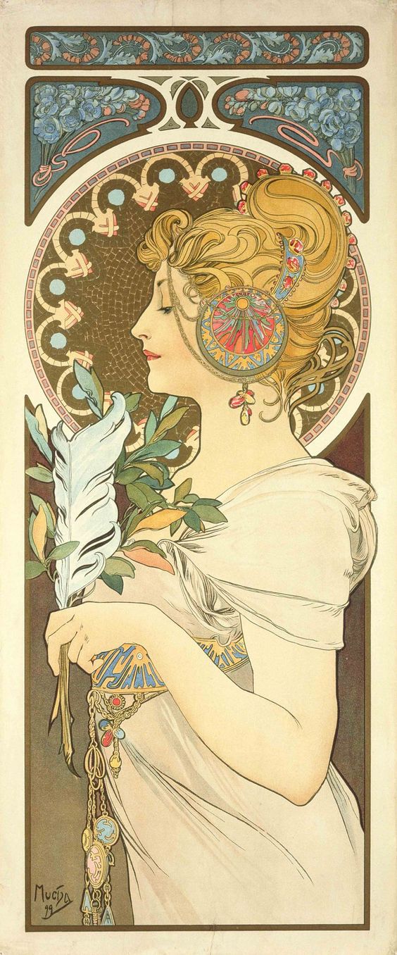
The designer who created our new logo was inspired by Libertae’s mission and the Art Nouveau movement. It was a turn-of-the-20th century art style developed in Europe and the U.S. known for its focus on intertwined natural forms (flowers/plants), decorative motifs and curved lines. Women became a focal point in the printed artwork.
Our ‘anthropomorphic’ logo combines the female form, a flower, a winding flower stem and the Letter L. These types of logos are less corporate and more personal because of the layered metaphors in the logo. Because of the deeply personal nature of addiction recovery, we believe this visual representation fits us well.
![]()
Metaphors:
- A script capital Letter L and the flower stem symbolize delicateness.
- The horizontal bar underneath the Letter L represents the firm foundation Libertae offers for a woman to grow.
- The thorns symbolize struggle as she grows.
- The flower represents her new future as she takes hold of it.